Building off the success of New York State’s Ending the HIV Epidemic (ETE) and Hepatitis C (HCV) Dashboards, our aim is to make statewide and county-level data more accessible and usable to service providers, policy makers, researchers, public health practitioners, and all residents of New York State including those affected by STIs.
explore the dashboard's key features
The STI Dashboard provides a comprehensive view of STI data at various geographic levels. At the national level, users can compare STI rates in New York to other states, providing a useful tool to contextualize trends within the national landscape.
County level data is available in multiple formats on the STI Dashboard, including an “all counties” trend line visualization (see figure below) as well as a county snapshot tool that allows users to take a deeper dive into STI rates by sex and age group within a county of interest. While currently not available, race/ethnicity data at the county level will be added to the dashboard in future updates.
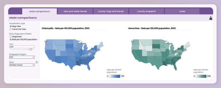
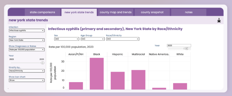
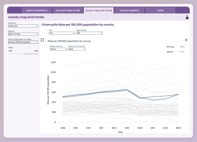
Whether you’re a service provider, policymaker, researcher, or community member, the STI Dashboard provides various tools to explore and analyze key trends of STIs in New York State. All visualizations on the dashboard are downloadable, making them easy to incorporate into your presentations, grant proposals, and reports.
For details on how to cite the dashboard in your work and other general information, please visit our FAQs page.
connect with us
As we begin to grow our audience, we encourage you to share this launch announcement widely with your colleagues and networks. Your feedback is invaluable as we continue to improve the dashboard.
For updates, forthcoming announcements, and future blog posts, please sign-up here and follow us on social media: